Saturday, 21 January 2012

Evaluation

1)  In what ways does your media product use, develop or challenge forms and conventions of real media products?


Our Magazine
Real-World Examples


Empire

February 2011
Circular information bubbles are common amongst a lot of the different magazine covers that we looked at. We decided to include “Ultimate reviews of 2011” in ours because it is the January 2012 issue.


Empire

October 2011
We chose to include a film reel across the bottom of the magazine further emphasising the concept of a film magazine. A similar concept is seen in Empire magazine, where they place a strip of images and headlines across the bottom of the magazine.

Total Film

January 2012
We decided to place our web address alongside the price and issue number. Although we were challenging conventions this was ultimately the best place to locate it.


Empire

August 2010
The ‘+’ symbol is common amongst many existing film magazines. We chose a slightly larger size than the existing convention because we feel this has a stronger and more immediate impact on the audience.


Empire

January 2011
During out photo shoots we ensure the models’ eyes were always looking directly in to the camera. In this example from Empire you can see their model is doing the same. This engages the audience which will make them more likely to take notice of our magazine on a newsstand.


Empire

September 2009
In our headlines we used words such as “exclusive” to draw attention to the articles. We also made use of colour to create emphasis on specific words. This is similar to existing magazine covers.


Total Film

Summer 2010 Special
Our magazine title features a headline above it. We placed both of these so they stretch right the way across the top of the magazine. We only added a subtle layer effect to the magazine title, challenging the codes and conventions shown in the Total Film example. However, Empire titles tend to be flat colours.


Our Poster
Real-World Examples


Wild Child
We chose to place the actress’ names all in the same case with emphasis placed on the surname. This is an existing convention but we decided to not copy the existing style exactly.

John Tucker Must Die
Our actress was staring directly at the camera. This is another common convention seen in movie posters. Her facial expression is similar to that of the model on the cover of John Tucker Must Die.


Tinker Tailor Soldier Spy
We placed a five star rating on the cover to create excitement and trust within the audience. We have seen this on Tinker Tailor Soldier Spy. It tends to be seen on high concept movies however we chose to use it on our rom-com poster. By challenging this convention we feel that we are providing our film with a greater sense of credibility, like that usually associated with big-budget blockbusters.


Bridesmaids
By placing a rough release date for the film we felt that we would create greater hype and excitement for the movie. Bridesmaids featured the release date in an easy to read font and in a highly-visible location. We were influenced by this common convention.


10 Things I Hate About You
Almost all of the movie posters we looked at featured logos of film studios and the technology used to create them (for example Sony or IMAX) in addition to information about the film’s directors and producers. We included similar text and logos on our movie poster. These conventions make it easy for the audience to easily recognise that it is a film poster.


Easy A
The overall layout for our design was influenced by the iconic border around the Easy A poster. We used this as the base for our design because we know how successful Easy A has been, and then combined this with lots of other conventions from different posters.


Our Trailer
Real-World Examples

Mean Girls
We conformed to the convention of keeping the release date vague. This increase anticipation for the movie. Additionally, it is a teaser trailer so we did not want to release too much information about the film.

Easy A
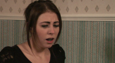
The reaction shot in Easy A was a pivotal moment in the trailer. We conformed to this idea by including a similar reaction shot. The close-up emphasised the actress’ reaction.

John Tucker Must Die
The MPAA warning at the start of the trailer gives the audience information about the suitability of the trailer. As a film aimed at teen girls we decided that film would be listed as “Approved for appropriate audiences”

St Trinians
The establishing shot is common trend in teen rom-coms. We chose to follow this common code and convention in our work by using a panning establishing shot to showcase the exterior of our location.

Wild Child
We were inspired by Wild Child’s use a close up of shoes. However, we wanted to use dolly shot within the corridor to add drama and impact to the trailer. This challenges existing trends.

Easy A
Our credits page conforms strictly to the existing codes and conventions of a movie teaser trailer. We chose to add a small amount of pink to increase the strength of the film’s brand identity.


Radical feminists would argue that men are dominant in this film and that our female protagonist is being oppressed by the male character. However, we do not feel that this is an appropriate analysis of our work. We think a post-modern feminist idea is much more appropriate. Our protagonist is not a victim and is not being ‘duped’ by the male character. She is making her own conscious decisions.

Laura Mulvey presents the idea of the ‘Male gaze’ and argues that the viewpoint in Hollywood films is male; therefore, women are shown as passive objects. However, we also object to this idea because we feel our film has a strong, central female character and in this case – the male character is objectified and ‘passed between’ the female characters.

In this sense, we feel that we are challenging existing codes and conventions of Hollywood movies. Despite this, one shot in our trailer shows the female’s legs. In this case, she is the subject of the desiring male’s gaze and therefore we are still restricted by the codes and conventions of existing media products. Coe presents the idea of ' the tyranny of genre', where creativity is limited due to a strong commercial imperitive existing within the industry.

Friday, 20 January 2012

Evaluation

2) How effective is the combination of your main product and ancillary texts?

We chose a consistent purple and pink colour scheme throughout our work to help create a strong brand identity. Purple and pink tones are stereotypically feminine colours and as a result of this, we chose them for use in our publications.

In all three of out media products we have chosen to use white and purple text alongside eachother. This further extends the brand identity for the movie.

Our actresses never change their hair and make up throughout the trailer and our ancillary texts. This creates continuity which will make the characters more recognisabel and iconic.


Myriad Pro is our chosen typeface. It is a bold, clear and modern sans-serif typeface. This makes it easy to read across all of our publications, particularly where legibility is important. Additionally, the font is not currently associated with any major movies so we feel it will help create a stronger brand identity for our film.


Brand Identity/Target audience

We chose all of these elements to create a strong identity to help appeal to our target demographic. We feel our design choices align well with consumer’s beliefs, tastes, aspirations and purchasing habits.

In terms of job classification, our target audience would be ‘E’ on the scale, as they are teenage students. However, we decided to target this audience as they are still considered to have a large amount of disposable income – due to their lack of financial responsibility.
Under the ‘LifeMatrix’ tool, our audience would be categorised as ‘fun/atics’ – meaning they are fun-seeking, active young people.

Adorno, a popular Marxist theorist, argues that media is turning society into a passive, conformist audience. We don’t dispute this; however we feel that the audience do not need to think critically to appreciate this type of media. This is because they fit into the ‘fun/atics’ category and are aware that what they are consuming is intellectually undemanding. They are simply seeking pleasure.


Evaluation

3) What have you learnt from your audience feedback?

Postmodernists believe that the audience constructs the text. Hartley, Fiske and Gauntlet expand on this idea by explaining that the audience - depending upon age, gender, class, ethnicity, etc – control the meaning of the text because they are able to interpret it regardless of what the media institution initially intended. Therefore, as Foucault argues, the power is within ourselves and our social relationships.

Due to this knowledge, we knew that different people will have different responses to our texts. As a result of this, we gathered audience feedback and used it to inform our decision making process.


This was useful because we intended to create a romantic comedy aimed at a female, teenage audience. Hannah is from our target audience, and as a result of this we feel we have done a successful job with our teaser trailer. This is particularly important because, as Barthes suggests, a text can be polysemic, meaning that individuals may interpret it differently. For example, we showed this to our parents and they did not interpret the text in the exact same way.


Beth liked the tracking shot of the character's legs. We too were pleased with this shot, and felt the slow movement of the character created appropriate tension and drama within the scene. This is an example of the male gaze. Beth also mentioned the use of blue colours within the trailer, although because it is only subtle, we believe it will not alienate the target audience.


Sam's response supported our decision to not use dialogue in the trailer. This worked in the 'Easy A' trailer, and our audience feedback suggests it will also be a successful aspect of our teaser trailer. He also thinks the music is appropriate, which we are pleased with because we chose the songs and musicians carefully to help appeal to our target audience.


Changes made due to audience feedback


Audience feedback inspired us to include a picture of a second actress on the cover of our magazine.


The comment suggested that the narrative of the film was not clearly displayed on the cover. We decided to include the second model to show the conflict between the two of them, hinting at the film's premise. This woudl also increase the sales of the magazine because it will create intrigue in the audience.

Thursday, 19 January 2012

Evaluation

4) How did you use new media technologies in the construction and research, planning and evaluation stages?


We set up our blog using blogger. We made use of image hosting tools as well as the ability to easily create a post that featured a wide variety of multimedia technology.

Bubbl.us allowed us to create mind maps and easily plot out the scenes in our trailer.

We made use of youtube's back catalogue of existing trailers when researching codes and conventions of trailers and throughout our research. Additionally, we used it to host our own footage.

We used google images to search for existing successful film posters. We also used google docs to host our photoshoot contact sheets.
We created a planning timeline at the start of our project. We then created another to show how we progressed.

 We created a survey on this website as part of our audience research. It automatically collates the results which made it easier than traditional methods.


 In our teaser trailer we chose to include a school bell sound effect. We chose to use this website as it offered the sound we wanted under a 'creative commons' release.


 For the creation of our poster and magazine cover, we spent a lot of time researching on da font looking at different type faces and discussing the effect they would have on our audience. In the end, we chose to use mostly system fonts. However, we did choose 'Pistoleer' for use as the title on our magazine.


This tool films the screen. We used it to record some of our editing techniques on illustrator and photoshop.

Voki creates simple animated 'talking heads' which we have used in this post to introduce the topics.


We used Microsoft Word for creating tables and word documents throughout our project, particularly during the planning stages before we uploaded our text to the blog.


We created a flow chart using Microsoft Powerpoint when we were researching Todorov's theory.


Adobe bridge was used for creating contact sheets and exporting them as PDF documents.


We used photoshop to create our poster and magazine cover. Additionally, we used it throughout our project to do various tasks with images, for example, re-sizing, cropping and re-touching images for the blog.


Illustrator was used specifically for creating the film reel at the bottom of our magazine cover. There is a video of us operating Illustrator later in the post.


We edited together our entire teaser trailer using Premiere Pro. It handles stills, video and audio. We also used it for adding captions and editing the colours of our footage.


Audacity is a very simple program that allowed us to cut audio clips so they were easier to handle in Premiere Pro.


Using Premiere Pro


Using Adobe Illustrator

Wednesday, 11 January 2012

Tuesday, 10 January 2012

Magazine creation


We have decided to call our magazine 'Premiere' as we believe it has strong connotations of the film industry. We chose the font 'pistoleer' because we particularly thought the point on the 'M' gave it a unique shape to make it more recognisable.

We then introduced the picture of our model. We picked the blue background to emphasise the colour of her eyes. We placed the shadows around the edges to create a feeling of depth, similar to that on the December 2009 Empire magazine cover.
We added the tagline 'The UK's best selling film magazine' as well as a barcode and price information. These were to replicate the styles of existing magazines.

After this we chose to introduce the film title to the magazine with the tagline"The claws are out". The film is the featured atrticle in the magazine and so we wanted to place as much emphasis on it as possible. To achieve this we decided to place an outer glow around the words, helping them to stand out against the model's clothing.
Following this, we decided to include a headline that reads "Massive preview special" to create excitement amongst the audience. The decision to include text was influenced by the Inception Empire cover. In addition to this, we created a white circle showing a sticker, as seen on many of the magazine covers we have researched. However, we were unsure about the design and placement.

We tried a different colour scheme because we were not sure if the purple was completely appropriate as it would alienate the male audience.
Further research of film magazines showed us that the inclusion of many headlines along the outside is a common convention and so we decided to replicate this idea. We continued to experiment with colour schemes and composition with the intention of getting the design aesthetically right.
Shrinking the circular bubble enabled us to fit in more headlines. We chose our font sizes carefully to ensure the emphasis was placed on the correct titles. We returned to our original colour scheme because we felt that the magazine should be targeting the same audience as the film. Additionally, the purple tone in the background is not overtly feminine so it wouldn't immediately alienate a male audience.

In the design on the right we chose to include a picture of our second actress. This was to emphasise 'the claws are out' and show the audience some of the film's narrative in a clear way. The actress' body language and clothing suggests darker tones and so we tried out a dark background to further emphasise this idea. However, this was unsuccesful. 
We changed the colour back to the original purple tones. After this we moved the model on the right down to improve the composition. We then added the film reel across the bottom (created using Adobe Illustrator) with two of our own images.

Because of the introduction of the film reel we needed to move the titles up slightly. We also changed the font in the 'ultimate review' bubble. This was influenced by the August 2010 Empire magazine cover.


Audience feedback request - Magazine cover


This is our magazine cover to promote the film, 'Popular'. We would appriciate comments on our work with what works well and what doesn't.